Company
CI
Word Mark


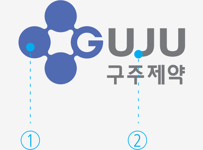
New CI of GUJU symbolizes following


First, GUJU highly regards human health and respects human life.
Second, GUJU is an eco-friendly company where nature is valued for a rich life
Third, GUJU has the advanced pharmaceutical technique to produce good medicines by researching and developing continuously


These three features are showed as three organically connected circles, leading to the word ‘GUJU’ to embody one icon.
Furthermore, GUJU pursues the infinite of possibilities on prolongation of life technology and harmonious and healthy life to grow as a revolutionary and future-oriented pharmaceutical company. These strong wills are also reflected in word mark.
Word Mark
The word mark is the most salient CI factor, and the suggested guidelines should be complied with every media identically. The color, brightness and chroma should be retained by the exact data.
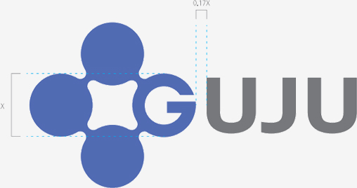

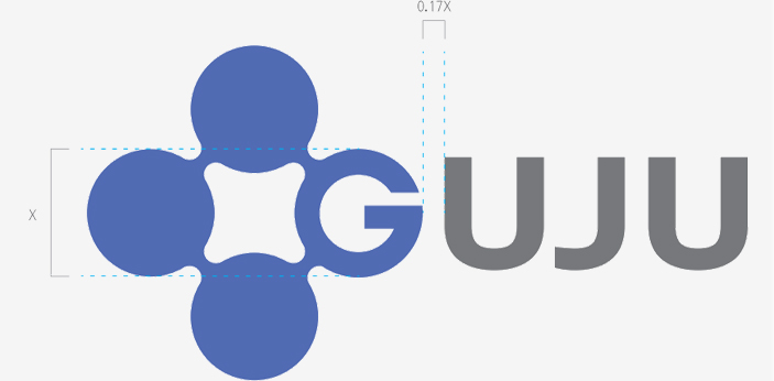

Grid System
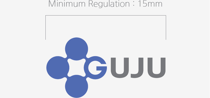
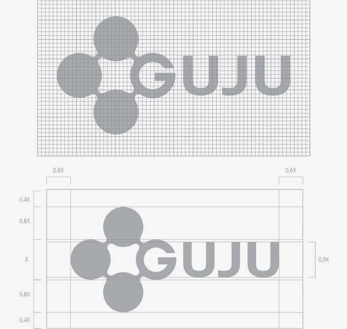
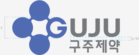
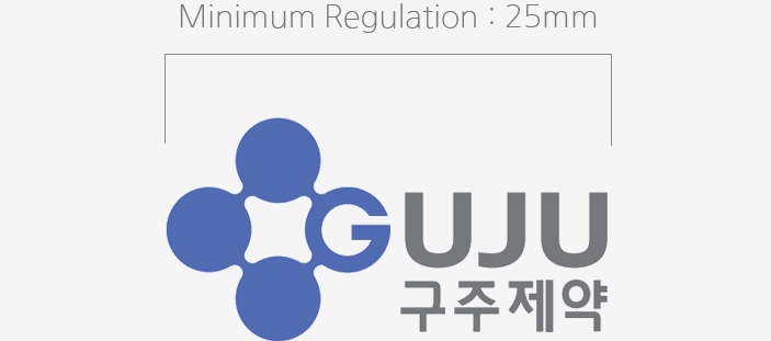
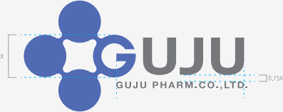
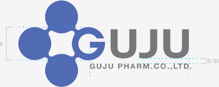
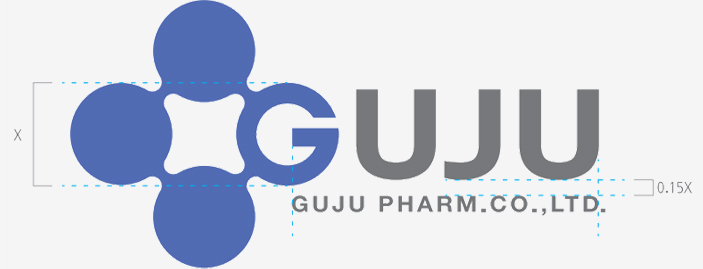
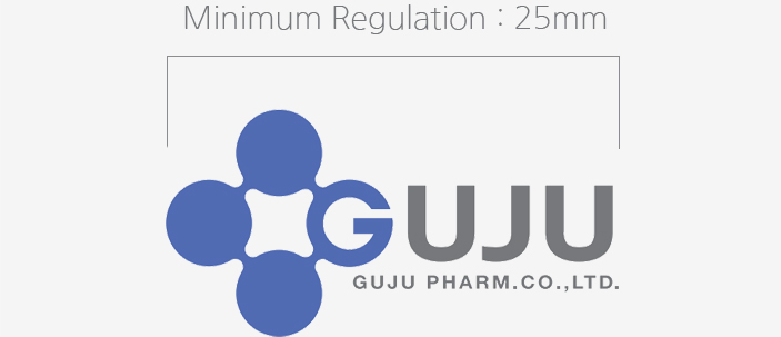
To prevent transformation, the computer files in CD-ROM should be printed out and used, however, in case the exhibition by data is impossible, the word mark should be produced exactly following the grid system in this article. The minimum space regulation means the minimum space to retain the visual independence and secure a regular space based on the height of the word mark when applying it.


Type of Logo
GUJU Logo in Korean is the key element to deliver our company’s image, so it was designed to be harmonized with the word mark.
GUJU Logo in Korean


GUJU Logo in English


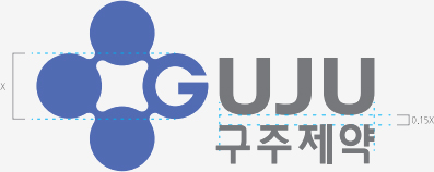
The base type signature - The upper and lower combination in Korean
The signature is the most effective way to present GUJU’s image either at home or abroad which is combined with the key element word mark and logo reasonably and systematically.


The base type signature - The upper and lower combination in English
The signature is the most effective way to present GUJU’s image either at home or abroad which is combined with the key element word mark and logo reasonably and systematically.

The applied type signature - The combination in Korean
The signature is the most effective way to present GUJU’s image either at home or abroad which is combined with the key element word mark and logo reasonably and systematically.
A ground rule is to use the base type of signature, however, in case of presenting a long width Korean logo, the applied type signature(Korean combination) can be used.


Dedicated Colors
The dedicated colors of GUJU are led by GUJU Blue and based on Process Color.
The signature is the most effective way to present GUJU’s image either at home or abroad which is combined with the key element word mark and logo reasonably and systematically.
Main Color

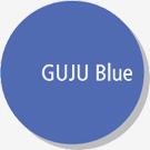


Pantone : Pantone 2726C
Process : C 75% / M 60% / Y 0% / K 0%
RGB : R 82 / G 107 / B 179
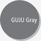

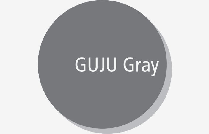
Pantone : Pantone COOL Gray 9 C
Process : C 0% / M 0% / Y 0% / K 65%
RGB : R 118 / G 120 / B 123
Sub Color

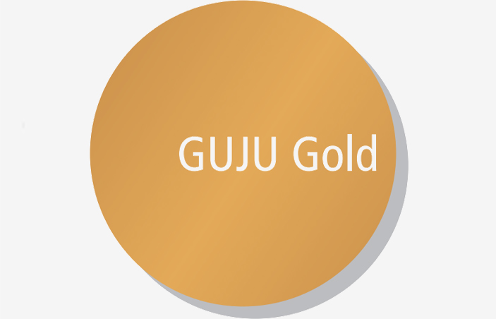

Color Regulation according to Background Color
The image is different by applied the background color not only the color of watermark.
The following shows the range of word mark application according to the change of the background brightness. The word mark and the unicolor version are represented as follows according to the change of background color.
Black & White


Guju Blue


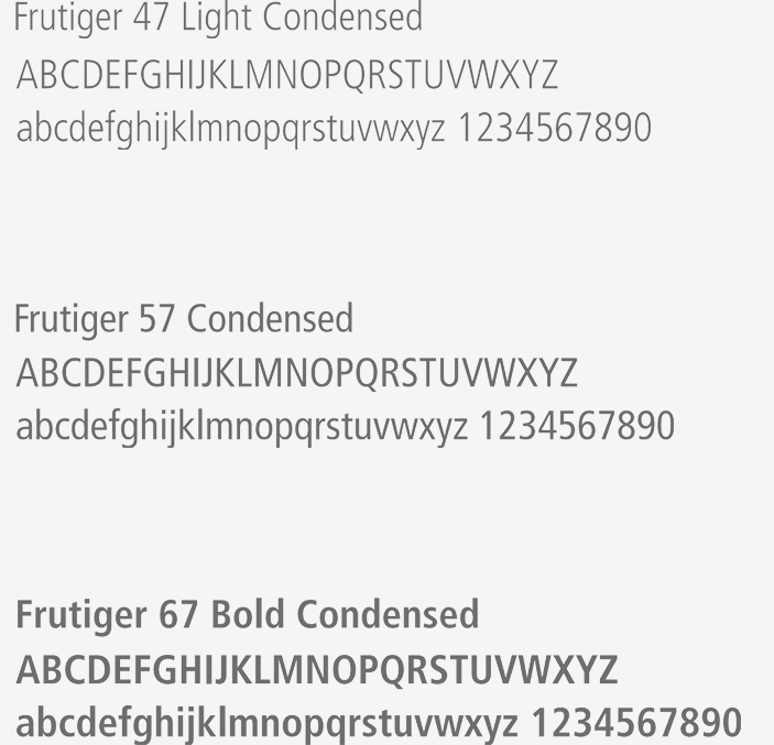
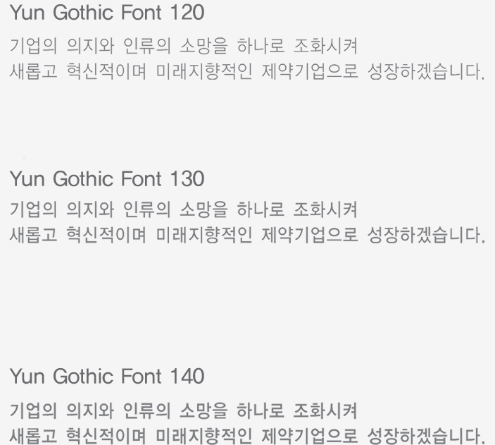
Custom Font
The custom font of GUJU is customized to reserve the consistent expression of identity, and it can be selected and used by the characteristic and content of media.
Custom Font in English


Custom Font in Korean


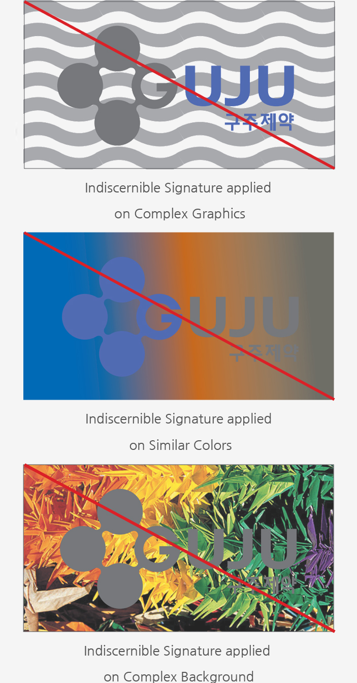
Restrictions on Use
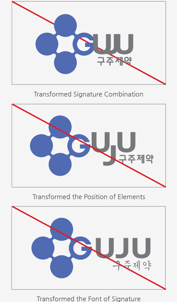
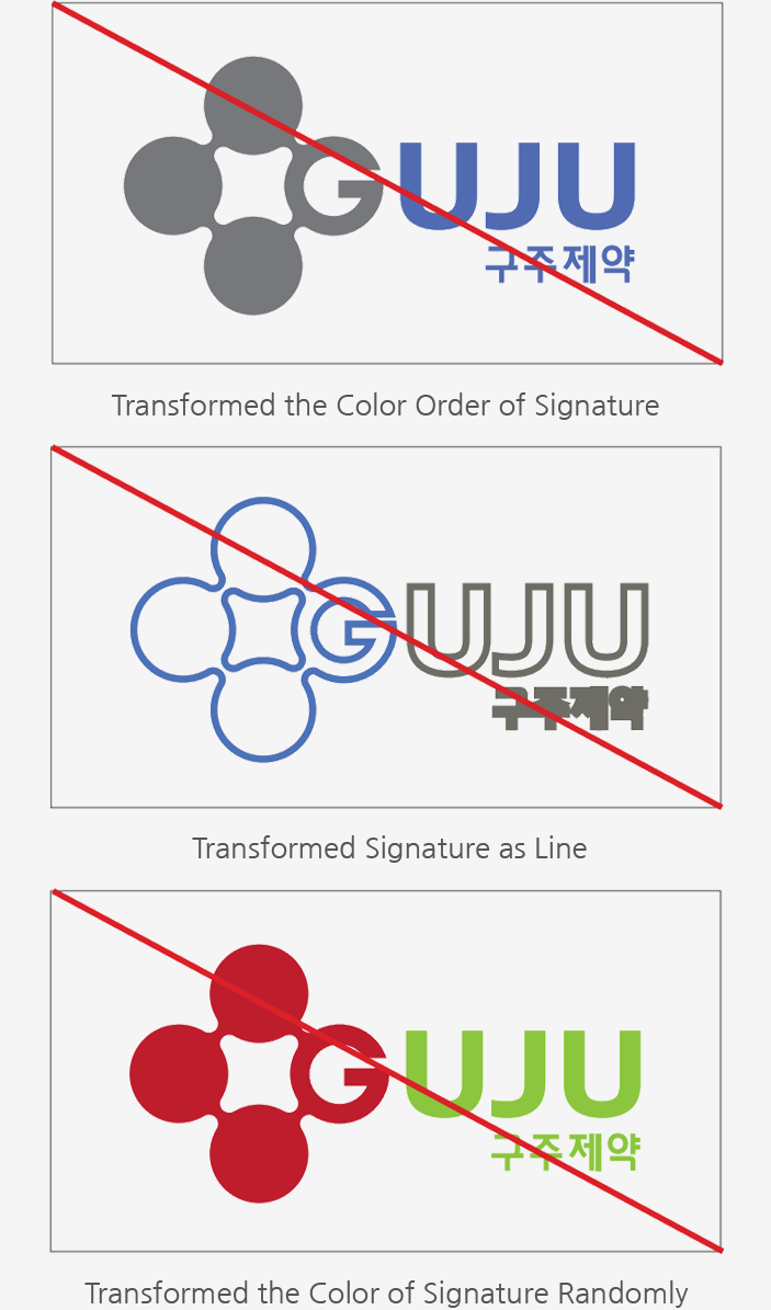
Word mark of GUJU should be used in the range of this regulatory manual and can not be transformed randomly by individuals.
In case of misusing the word mark out of the regulation, the original image may be corrupted. Therefore, the word mark should be presented within the application range on the shape and color whether it is described below or not and complied with the regulation.
Shape Variation


Color Variation


Background Variation


